This post originally appeared on Hockey Jersey Concepts on October 14th, 2016.
Hello folks! A few weeks ago when I was discussing the Calgary Flames uniforms (and how I think they only need a couple of changes), I mentioned I'd still rank their jerseys right near the bottom of the league. That got me thinking, where would I rank the jerseys of the other NHL teams? I also didn't have anything else to discuss today, so I decided to kill two birds with one stone by ranking the home and road uniforms of every NHL team, and sharing that list with all of you. But to keep this post from getting too long, I broke the list down into four parts, starting with teams ranked 30th to 23th.
30. Colorado Avalanche
It came down to the Avalanche and the Flames for last place, and in the end I decided Colorado's jerseys are the worst. There's really nothing I like about their striping pattern, the side panels are bad, the piping is worse, and I hate how the yokes have no outlines (especially on the home jersey). It also doesn't help that these jerseys replaced the Avalanches' great mountain jerseys. That being said, I do like the colour scheme used by these jerseys, and also the logo that's on the front.
29. Calgary Flames
Like I said a few weeks ago, I wouldn't mind the Flames jerseys if only the piping and the flags were removed. But with those features the Flames jerseys rank 29th in the NHL, the flags stick out like a sore thumb (especially the blue Alberta flag), and it drives me crazy how the piping ends abruptly. I'm also not a fan of the black armpits on the home jersey, but I think the side panels are okay, and I like the rest of the design.
28. Ottawa Senators
When the Senators jerseys were unveiled back in 2007, they shared this template with both the Pittsburgh Penguins and Tampa Bay Lightning. That (re-using templates) is one of biggest pet peeves, and one of the main reasons the Senators rank so low on this list. If I ignored that fact and just looked at the design itself, I probably wouldn't dislike these jerseys as much, but they wouldn't be much higher on this list either.
27. Buffalo Sabres
The Sabres jerseys really make me mad because they so close to being good, but they're completely ruined by the addition of silver. Not only do the silver piping and armpits look awful, but the silver also messes up the stripes on the road jersey by making the outer blue stripes much too thin. The front numbers also should be retired.
26. Anaheim Ducks
We're only at number 26, but at this point in the list I don't really dislike the jerseys anymore, I'm more neutral towards them. For Anaheim, I like the general idea of the jerseys with the curved arm stripes and the side panels, but there's some important details I dislike. The striping pattern is too busy for my tastes, I think at least the thin orange stripe should be removed. The extra black outline on the logo of the road jersey also irritates me.
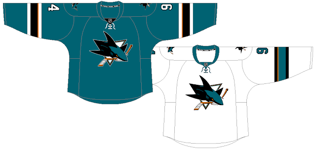
25. San Jose Sharks
San Jose's jerseys have some good things going for them. I'm a big fan of their colour scheme, and I also like their logos. In the end though, I decided their jerseys were just too simple, and they got beat out by 24 other teams. Also, I think the road jersey could use some more teal somewhere in the striping, maybe a teal yoke, cuffs, or hem trim (or all of the above).
24. Los Angeles Kings
I didn't mean to clump the three California teams together, but that's the way it ended up. My main complaint about the Kings jerseys is the piping, it's not as bad as the piping on the Flames or Sabres jerseys, but I don't like how it interacts with the arm stripes. I've also never been a fan of this Kings logo, however I do think this colour scheme works well for the Kings, and I also like their number font.
23. Nashville Predators
I hate having the Predators this close to the bottom of the list, because I truly love how they embraced yellow with their redesign in 2011, and I also like their logo and number font. But I can't get past the fact that they basically just re-used the Blues original edge template, and the piping overlapping the hem stripes also grinds my gears.
Are you surprised by any of these rankings? Are there any other teams you'd have in the bottom eight instead? Share your thoughts in the comments.


No comments:
Post a Comment