November 20, 2024

Article Archive #55 - That's All Folks!

This post originally appeared on Hockey Jersey Concepts on April 28th, 2017.

Hello folks!

Sadly the rumours are true.  This is my last post as an HJC writer.

It's been a lot of fun writing for HJC, and it's something I still really enjoy, but unfortunately I just don't have enough time to commit to this position anymore.  So I decided to hang up my keyboard, as I didn't want to continue on with shorter, rushed posts.

That doesn't mean you'll never hear from me again though, I'll still be visiting this site everyday, leaving the occasional comment, and submitting any concepts that I make.  To put it another way, I'll still be part of the HJC community.

And HJC really is a community.  It wouldn't exist without all of you, the readers, the commenters, everyone who submits concepts, and of course the other writers as well.  Not just current writers either, there have now been 23 people who have been HJC writers at one point or another (see the end of this post).

I think that number says a lot.  That there have been 23 folks who have volunteered for this website over the years, really shows how much this site means to people.  That's not even counting everyone who's applied to write for HJC but had to be turned down.

HJC also obviously wouldn't exist without Ryan Haslett, it's founder, and current administrator and Saturday writer.  He does a lot of behind the scenes stuff to make this website work, I think more than most people realize.  Thank you for everything, Ryan!

Last of all, I want to take this opportunity to welcome TC Moore to the writing team.  I've been very impressed with how much his concepts have improved over such a short amount of time, and I'm sure he'll make a great writer as well.  Welcome aboard, TC Moore!

--------------------------------------------------


You may or may not recall this, but the last time we were looking for a new writer, I made a list of everyone who had written for HJC and how many posts they wrote.  It seemed to be fairly well received, so I thought a good way to end my last post would be to provide an update of those "standings".  Current writers are in bold.

1.  Ryan Haslett, 933 Posts (Nov 2009 - Present)

2.  WinnipegJets96, 252 Posts (Aug 2012 - Present)

3.  Dylan Alexander,178 Posts (Aug 2012 - Dec 2015)

4.  William Butala, 123 Posts (Sept 2013 - Jan 2016)

T-5.  Brendan Poe, 111 Posts (March 2015 - Present)

T-5.  Steven Grant, 111 Posts (Aug 2012 - June 2013 & Jan 2016 - April 2017)

7.  Caz Williams, 100 Posts (Oct 2013 - Feb 2015 & Jan 2016 - Aug 2016)

8.  Phil Beck, 79 Posts (May 2014 - Sept 2014 & Feb 2016 - Present)

9.  Dylan Nowak, 70 Posts (July 2013 - Jan 2014 & March 2015 - Jan 2016)

10.  Steven Marculaitis, 66 Posts (Jan 2016 - Present)

11.  Colin May, 53 Posts (Aug 2012 - April 2013 & Dec 2013 - May 2014)

12.  Jack Godlewski, 36 Posts (May 2015 - Feb 2016)

13.  Tyler Gross, 35 Posts (Nov 2012 - Aug 2013)

14.  Alex Offenbach, 34 Posts (Jan 2014 - Sept 2014)

T-15.  Chase Carlson, 33 (Sept 2016 - Present)

T-15.  Kevin Wos, 33 Posts (Feb 2013 - Sept 2013)

T-17.  Christian Legault, 30 Posts (Sept 2014 - April 2015)

T-17.  Ricky Mazella, 30 Posts (Aug 2012 & May 2013 - Nov 2013)

19.  Caden Patafie, 25 Posts (Sept 2014 - March 2015)

T-20.  Glen Cuthbert, 13 Posts (Oct 2010 - Feb 2011)

T-20.  Thallos, 13 Posts (Aug 2012 - Nov 2012)

22.  Thomas Livingstone, 1 Post (Aug 2012)

23.  TC Moore, 0 Posts (May 2017 - Future)

As you can see, I'm retiring tied for fifth in all time posts.  I'm okay with that.

Thank you all!  And for one last time...

That's all folks!

November 19, 2024

Article Archive #54 - NHL Uniform Countdown (Specialty Jerseys)

This post orignally appeared on Hockey Jersey Concepts on April 7th, 2017.

Last October I ranked the home and road uniforms of each NHL team.

Back in February I did the same with alternate uniforms.

And now it's finally time for the conclusion of my "NHL Uniform Countdown" series, as today I'm ranking all the specialty jerseys worn in the NHL during the 2016-17 season.

I've decided to split these jerseys into two categories, "New" jerseys and "Vintage" jerseys.  The "New" jerseys category will include Stadium Series jerseys, Centennial Classic jerseys, and 50th Anniversary jerseys, while the "Vintage" jersey category includes Winter Classic jerseys, Heritage Classic jerseys, and other miscellaneous throwback jerseys.  I created these categories because comparing a modern jersey to a throwback jersey is like trying to compare apples to oranges.

Okay, let's get started!

Top "New" Jerseys

6.  Philadelphia Flyers 50th Anniversary Jersey

The striping pattern of the Flyers 50th Anniversary jersey is fairly nice, but I'm just not a fan of the gold numbers.  I'd prefer black numbers with a gold outline.

5.  Detroit Red Wings Centennial Classic Jersey

I love the detail of the Stanley Cup winning years "engraved" onto the silver sleeve stripe, but overall I think the Red Wings Centennial Classic jersey suffers from an identity crisis.  It has too many stripes to be modern, but it's not vintage either.  It's a poor mix of the two.

4.  Philadelphia Flyers Stadium Series Jersey

The Flyers Stadium Series jersey has several unique features, some of which I like and some I don't.  I like the raised sleeve stripes and the large sleeve numbers on those stripes, but I'm not a fan of the outline-only back numbers or the contrasting orange nameplates.

3.  Toronto Maple Leafs Centennial Classic Jersey

Unlike their opponent, I think the Maple Leafs did a good job of combining old and new with their Centennial Classic jersey.  But I also think this jersey looks a bit generic, due to it's similarities to the Panthers new jerseys.

2.  Los Angeles Kings 50th Anniversary Jersey

You don't see grey (or silver) jerseys very often, which is part of the reason I have the Kings 50th Anniversary jersey ranked so high (I like jerseys with unique main colours).  I'm also a fan of this striping pattern, I think this jersey would make a good full-time third jersey (if the gold accents were removed).

1.  Pittsburgh Penguins Stadium Series Jersey

Yellow is also a less common jersey colour, and I think the Penguins pulled it off wonderfully with their Stadium Series jersey.  I like the striping pattern, the triangle-less logo, the stencil font for the name and numbers, and especially the yellow helmet.  The only thing I'm not a fan of is the white in the collar, but that's a fairly minor complaint.

Now on to the vintage jerseys!

Top "Vintage" Jerseys

7.  Chicago Blackhawks Winter Classic Jersey

The Blackhawks Winter Classic jersey doesn't look bad, it actually looks good, but it's just too similar to their normal road jersey.

6.  Arizona Coyotes Throwback Jersey

I like the Coyotes throwback jersey as a specialty jersey worn for a few games each year.  I think it's too dated to come back full-time though, but that doesn't affect it's rating on this list, I just happen to like the upcoming jerseys more.

5.  Los Angeles Kings Throwback Jersey

The Kings current jerseys aren't very colourful, so it's a nice change of pace when they wear this gold throwback jersey.  I did prefer the purple version of this jersey though, but I do think this gold version is very nice as well.

4.  St. Louis Blues Winter Classic Jersey

I've always been a fan of the Blues original jerseys, so as you can guess I like their Winter Classic jersey as well (which is based off of their original blue jersey).  I think the lighter shade of blue looks great too, but I don't like the use of vintage white.

3.  Toronto Maple Leafs "St. Pats" Jersey

The only thing I don't like about the Maple Leafs "St. Pats" jersey is the gap between the boxes for double digit back numbers.  Other than that I think this jersey is great, I love how it honours the franchise's history, it's a fun way to celebrate St. Patrick's day, plus the colour green is very underused in the NHL.

2.  Winnipeg Jets Heritage Classic Jersey

In my opinion, the red pants are the best part of the Jets Heritage Classic uniform.  The splash of colour the pants provide is very nice, and the double stripes with the jet logo within them look great.  The jersey itself is good too, there's nothing that special about it, but it doesn't have any flaws either.

1.  New Jersey Devils Throwback Jersey

Let's get this out of the way right away, I don't think the Devils should promote this throwback jersey.  It wouldn't be the worst thing in the world, but I think the Devils could do better.  However, I think this jersey is perfect for how it's currently used.  The colour scheme, striping pattern, and red helmet provide lots of vintage charm, and (like with the Leafs) it's a fun way to celebrate St. Patrick's day.

So those are my thoughts on all the specialty jerseys worn in the NHL this season.  If you disagree with me, feel free to share your thoughts in the comments.

November 18, 2024

Article Archive #53 - Red and Green?

This post originally appeared on Hockey Jersey Concepts on March 24th, 2017.

Could the New Jersey Devils be returning to their red and green colour scheme next year?

If you asked me 24 hours ago, I would've been confident the answer was no.  Why?  Because when we first learnt the Devils were getting new uniforms, it was reported that their current colour scheme would not change.

However, yesterday evening Phil B (HJC's Wednesday writer) directed me to the following tweet, which shows some marketing material sent to Devil's season ticket holders.


As you can see, their red and green colour scheme is used here, as well as the slogan "True Since '82" (which is the Devils inaugural year, and of course when their red and green jerseys debuted as well).  Additionally, if you look on the season ticket membership page of the Devils official website, you'll see a banner which also uses their old red and green colour scheme (pictured below).

Image from NHL.com/Devils

So what does all this mean?  I honestly don't know.  It could be nothing, just the Devils marketing department using nostalgia to try to sell more season tickets (or they could be trying to mislead us jersey enthusiasts).  It's also possible that these are actual clues towards the Devils new look, and they are returning to their original colour scheme for next season.

For right now I'm going stick with the original reports and guess their colour scheme isn't changing, but I wouldn't be surprised either way.

What colour scheme do you think the Devils will use next season?  And which one do you want them to use?  Let us know in the comments.

November 17, 2024

Article Archive #52 - NHL 100 Classic

This post originally appeared on Hockey Jersey Concepts on March 17th, 2017.

Hello folks, and happy St. Patrick's Day!

This is normally the part of the post where I say "there's no news today, so let's get right to the concepts," but there actually is news today so I should probably do that first.

Image from @PR_NHL on Twitter

For a while now there had been rumours that an outdoor game would take place in Ottawa in late 2017, and the NHL made it official today announcing the NHL 100 Classic.  The Senators will face of against the Canadiens at Lansdowne Park in Ottawa, on December 16th.  It will be the Senators second outdoor game (first time hosting), and the Canadiens fourth (all on the road).

The logo for the event uses the same general style and colour scheme as the NHL's Centennial Classic logo, so I'm guessing that the jerseys will also be a bit more modern like the Centennial Classic jerseys were.  Honestly I was hoping this game would be a retro event like a Heritage Classic (and maybe it still will be), with the Senators throwing back to their old barber pole jerseys, but I'm still exciting to see what they come up with.

As for the name "NHL 100 Classic", I think it's a bit clunky and it definitely doesn't roll off the tongue as nicely as "NHL Centennial Classic", but I also think it would be a bit confusing having two events with the same name in the same calendar year.

Photo by Jim McIsaac/Getty Images

Now getting back to St. Patrick's Day, the New Jersey Devils wore their beautiful red and green throwback jerseys last night.  They were matched up against the Philadelphia Flyers, who were wearing their regular road jerseys, so it was a great looking vintage game all-around.

I love the Devils tradition of wearing their vintage jerseys for St. Patrick's Day.  It's especially special since they only wear these jerseys once or twice a year, if they were used more often the novelty would wear off and it would become a less memorable event.

Photo by Ernest Doroszuk/Toronto Sun

Lastly, don't forget the Toronto Maple Leafs will be wearing their throwback St. Pats jerseys tomorrow when they host the Chicago Blackhawks (that should be another beautiful match-up).  The players have already been practicing in their green pants and gloves (shown above), and I can't wait to see how everything looks together.

Hopefully the Maple Leafs follow the Devils lead, and bring back this jersey annually for St. Patrick's Day.  It's the perfect jersey for this holiday, it literally says "St. Pats" right across the front.

November 16, 2024

Article Archive #51 - New Faces

This post originally appeared on Hockey Jersey Concepts on March 3rd, 2017.

Hello folks!  For today's intro thought I'd take a look at some of the players that were traded over the past week, to see how they look in their new uniforms, what numbers they're wearing, and all that stuff.  Let's get right to it!

Photo by Harry How/Getty Images

Jarome Iginla will always be remembered as a Calgary Flame, but he's been on three (now four) other teams since then, so it doesn't look too weird (to me at least) seeing him as a Los Angeles King.  What does look weird to me is him wearing number 88, it will take me a while to get used to that.

Photo by Bruce Bennett/Getty Images

Thomas Vanek has been a bit of a nomad lately, as the Florida Panthers are Thomas Vanek's sixth team in just the last four seasons.  With the Panthers he returned to his regular number 26, after wearing number 62 in Detroit.

Photo by Jared Silber/NHLI via Getty Images

The Washington Capitals made one of the biggest deals at the trade deadline, landing Kevin Shattenkirk from Blues.  He kept his number 22 with the Capitals.

Photo by Francois Laplante/Freestyle Photography/Getty Images

As a Canucks fan, seeing Alex Burrows in an Ottawa Senators uniform looks very strange to me.  He was always a fan favourite in Vancouver (and hated everywhere else), but it was the right move for the Canucks to trade him and focus on the future.

Photo by Bruce Kluckhohn/NHLI via Getty Images

Martin Hanzal switched from number 11 to 19 with his move to the Wild, since number 11 was already taken on the Wild by Zach Parise.

Photo by Gerry Thomas/NHLI via Getty Images

The Kings were the only team to make a significant move in net at the deadline, adding Ben Bishop from the Tampa Bay Lightning.  Bishop started his first game for the Kings on Tuesday, still wearing his old lightning mask and in number 31 instead of his usual number 30 (number 30 is retired on the Kings for Rogie Vachon).

Of course this list doesn't include everyone that was traded at the deadline, these were just the players that stood out the most to me.

November 15, 2024

Article Archive #50 - NHL Uniform Countdown (Third Jerseys)

This post originally appeared on Hockey Jersey Concepts on February 17th, 2017.

Hello folks!

Do you remember back in the fall when I ranked the home and road jerseys of each NHL team?  I've been meaning to do the same for third jerseys, and I've decided now's as good a time as any.  This time though I'm going to do it all in one post, quickly counting down to number 6 and then I'll provide longer reviews of my top five jerseys.

I also want to note that I'm only ranking full-time third jerseys.  I'm not including any outdoor game jerseys (unless they were already third jerseys), any limited occasion vintage jerseys, or even any 50th anniversary jerseys.  I might rank all those specialty jerseys in a future post though.

Okay, here we go!

15.  Tampa Bay Lightning

I don't mind the black, but I dislike the "Bolts" script and the striping is generic.

14.  Columbus Blue Jackets

This jersey would be much, much better without vintage white.

13.  New York Islanders

It's a decent looking jersey, but it's not a good look for the Islanders in my opinion.

12.  San Jose Sharks

I think this jersey is underrated, but it's still not great.

11.  Carolina Hurricanes

I like how unique this jersey is, but it's starting to look dated, especially the number font.

10.  Minnesota Wild

This could challenge for the top spot if it used their primary logo on the front, and if it had no phantom yoke.

9.  Vancouver Canucks

I like this jersey on it's own, but it's just too similar to their home jersey.

8.  New York Rangers

I do think this jersey is overrated, but I also don't think it's a bad jersey, if that makes sense.

7.  Washington Capitals

I'll admit this jersey is dated, but I still like it.  I wouldn't want it as their home jersey though.

6.  Ottawa Senators

I like this as a third jersey, but it shouldn't be promoted.  The "O" logo isn't primary logo material.

5.  Colorado Avalanche

Colorado's third jersey is simple and modern, which I think works well in this case.  It also has a great font, and a very solid logo which both shows state pride and honours the city's previous NHL team (although, I don't think this logo should become the team's primary logo).  Sometimes I wonder if this jersey would look better paired with burgundy pants, but it's not like I dislike the navy blue pants.

4.  Anaheim Ducks

Not too long ago, the trend in the NHL was to use dark and drab colours.  I'm so glad those days are over, I much prefer colourful jerseys like this orange option from the Ducks.  I also like how this jersey combines two different era's, using elements from both their Might Duck days (main logo and hem stripe pattern) and their current identity (sleeve pattern, fonts, colours, and shoulder logo).  Once again though, I don't think this jersey should be promoted, as I don't think the Mighty Duck logo should return as the team's primary logo.

3.  Edmonton Oilers

The Oilers are another team that have found success (jersey wise) by using a bright colour as the main jersey colour.  The historical aspect of this jersey is also nice, especially since they kept unique details like the shoulder numbers and the overlapping collar.  Although it would have been even more accurate if they used a larger shoulder yoke, plus I think the shoulder numbers would look better in a larger yoke.

2.  Boston Bruins

I loved the Bruins' 2016 Winter Classic jersey as an outdoor game jersey, but I wasn't so sure I'd like it as a full-time third jersey.  Well, it turns out I do like it as a third jersey (as you could probably tell by its ranking).  I thought the logo might be too vintage for anything other than a Winter Classic game, but I've decided it works for a franchise as old as the Bruins.  I'm also not normally a fan of vintage white, but I don't mind it on this jersey.  The only thing I don't like is the brown in the logo, I think it should be black instead.

1.  Calgary Flames

I had Calgary at number 29 in my ranking of home and road jerseys, but their third jersey comes in at number one.  I love the bright colours of this jersey, they're especially fitting for a team called the Flames.  I like the history behind this jersey as well, the Flames wore this design for their first 14 years in Calgary (as well as seven years in Atlanta), and they won a Stanley Cup in this jersey back in 1989.  Hopefully this jersey gets promoted next year, and I'm not just saying that because of how bad their current jerseys are (although that's a factor as well).

What do you all think of these rankings?  Are there any jerseys you think I'm totally wrong about?  Who would you have as number one?  Feel free to share your thoughts in the comments!

November 14, 2024

Article Archive #49 - Throwback Friday

This post originally appeared on Hockey Jersey Concepts on February 3rd, 2017.

It's time for another installment of everyone's favourite segment, Today in HJC History!  February 3rd has been a fairly big day for HJC, it includes the unveiling of two COTY winners, plus a review of an NHL team's new primary logo.  So let's take a trip down memory lane, starting all the way back in 2010.

February 3rd, 2010 (No Post)
Image from February 1st, 2010 HJC post.

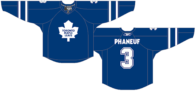
There was actually no February 3rd post back in 2010, but the previous post on the 1st is an interesting one to look back on.  On that post Ryan talks about the two trades the Leafs had just made to acquire Dion Phaneuf and JS Giguere.  He wisely said, "Only time will tell if these guys work out."  Looking back, the trades weren't awful, but they didn't bring much success to the Leafs either.

Image from February 3rd, 2011 HJC post.

The post on this day back in 2011 was written by Glen (HJC's first guest writer), as part of his NHL Rebrand series.  It features his concepts for the Blues, Sharks, and Lightning.  The Blues concept (shown above) is my favourite of the three, but the other concepts are nice as well.

Image from February 3rd, 2012 HJC post.

On February 3rd in 2012, it was announced that Josh's Lethbridge Hurricanes concept won the 2011 COTY.  This concept actually made it off the computer screen and into real life, it became the Hurricane's third jersey (with a few minor changes) starting in 2012-13.

Image from February 3rd, 2013 HJC post.

The COTY winner was also announced on February 3rd in 2013.  That time it was Justin winning the 2012 COTY with his Ottawa Senators concept.  Also announced was the news that HJC would have seven posts a week moving forward (previously there were only six, with concept posts from Monday to Friday, and a weekend update on Sunday).

Image from February 3rd, 2014 HJC post.

2014's February 3rd post was a regular concept post.  WinnipegJets96 talked about high school graduation, plus there were 14 concepts including two from Jordan's "Winter Classic Games of the Past" series (his 1986 Winter Classic concept shown above).

Image from February 3rd, 2015 HJC post.

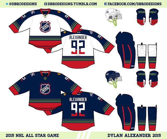
The post on this day in 2015 was also a standard concept post, written by Caden.  He discussed the 2015 Super Bowl (like most people, he wasn't a fan of the Seahawks decision to pass the ball from the one yard line with 26 seconds left in the game), and then he reviewed six concepts including Dylan's 2015 All-Star Game concept (shown above).

Image from NHL.com/MapleLeafs

Exactly one year ago today I reviewed the Toronto Maple Leaf's new logo, which had been unveiled the previous evening.  At that time I approved of the new logo, saying "I love it" and giving it a 9/10 rating.  After a year I still feel the same way (I might even bump up my rating to a 9.5/10).  The post also featured a Quebec Nordiques concept from Matt, which was nominated for COTW by six different people (that might be an HJC record).